

From the series of written paper art comes another artist that deals with paper and words. But if Su Blackwell is a reader, Keira Rathbone is a writer. She typewrites all her works of art.
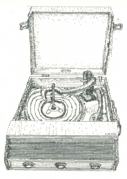
At first, if you see her works from a distance (both in real life and on virtual media) nothing strikes you. However, there should but a “Warning! You might drop your jaw if you look closer” sign next to each of her works of art. Whether you ignore the sign or not, your jaw will drop — it’s your responsibility, and her success. Keira actually has the patience to apply a mathematical precision in each and every representation of the objects she designs. Think about it: you have absolutely no control over the brush and you are confined to a limited number of letters and symbols… not to mention color.
The presentations she typewrites are buildings, people and nature. Thus architecture isn’t new to Keira Rathborne. For example, Wimborne Minster (seen below) was a commissioned work. You can see the details of what looks like a simple ink drawing at first.


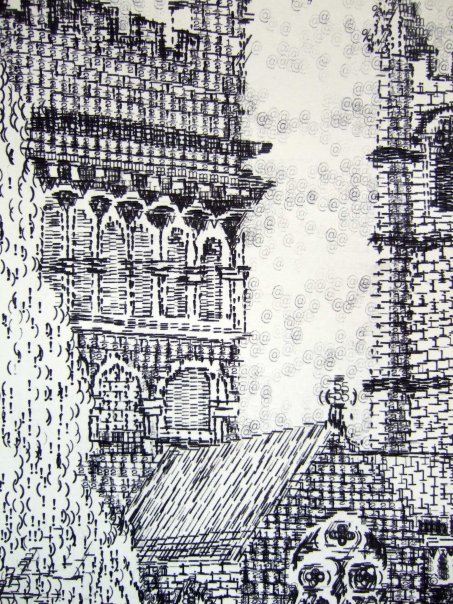
Photo by Keira Rathbone via Joshua Riehl
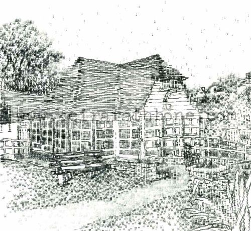
But she doesn’t always deal with architecture; still life is also one of her passions as you can well see in her art.

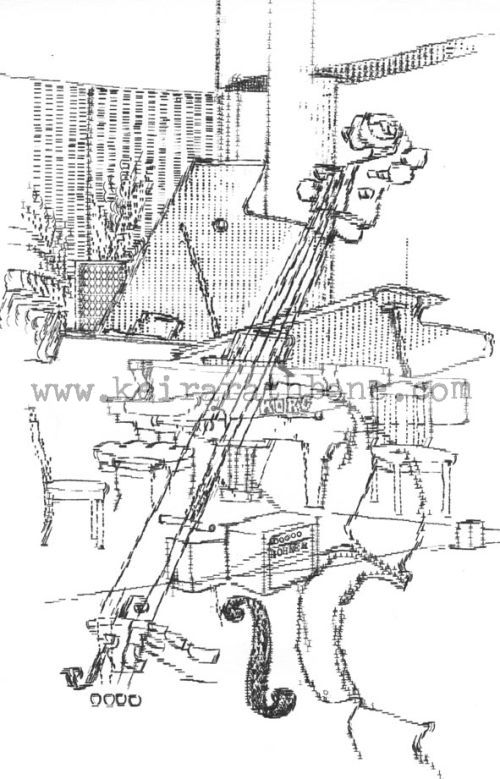
And let’s not mention the people that she has a great fondness for; it’s easy to realize that since no other art category on her website features several portraits.

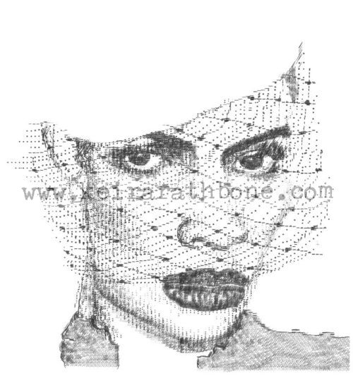
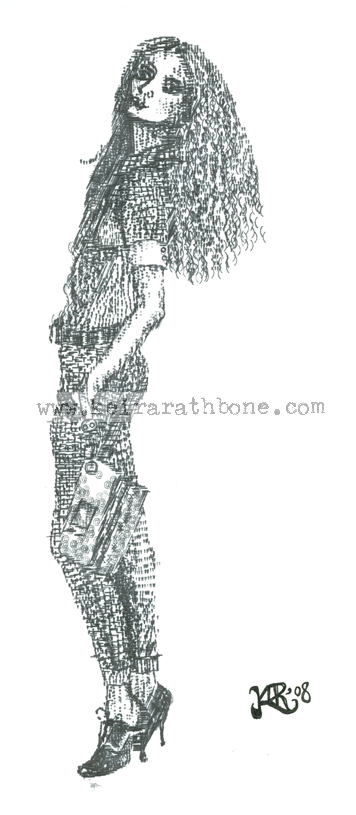

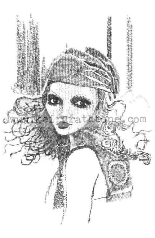
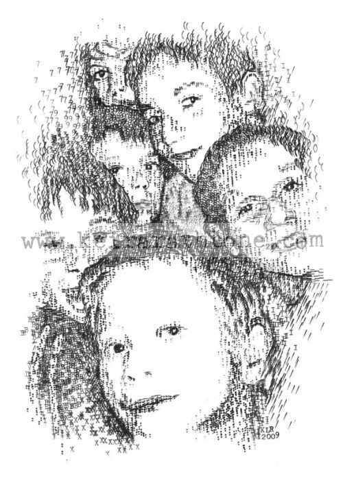
Photos by Keira Rathbone
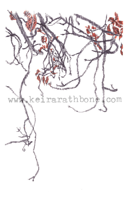
As you can well see, color isn’t the strongest point of these works… or is it? She uses red only on what seem to be “special occasion artworks”. How does this well grounded frugality in color influence her work? You tell me…
Till then, be inspired to design your own fantasy movie fan art and print your own custom posters.

No field notes yet. Start the thread.